28 Aug 2024 Workaround for A Dynamic Date Slicer in Power BI
During our extensive experience in developing Power BI reports, we have seen that date filtering is a key aspect for all our customers, but default Power BI slicers are a bit limited in this respect. A frequent request from our customers is for a date slicer that shows all dates (for example, in a month-year format) with the last N dates automatically selected, while still allowing easy access to the remaining unselected dates. Unfortunately, Power BI currently does not support this functionality within a slicer visualisation, requiring users to manually update the selected dates. One way to select the last N dates (whether days, months, or years) is by using the relative date filtering feature; but this approach lacks flexibility, and access to the filter pane is not always available to all users.
It seems like users lack tuning options when it comes to visual date slicers, but there’s good news – we have developed a workaround that solves this kind of problem!
Although solutions do exist, they only cover some of the issues faced here and also present some drawbacks. These issues are magnified for customers managing multiple reports, leading to the need for frequent user interaction to update periods, which, in turn, increases maintenance time.
In this article, we’ll explore the available alternatives offering users a dynamic date slicer in Power BI and look at their respective advantages and drawbacks; we’ll then introduce our own innovative solution, designed to overcome these challenges, as well as providing users with enhanced automation and flexibility.
Available Solutions
We have tested various existing solutions to deal with these challenges, and while none of them fully meets our requirements, they may be a good fit for some cases.
Power BI Built-In Relative Date Filter
This is the easiest and most convenient approach. Power BI Desktop offers a built-in solution through its relative date filter feature, accessible within the filter panel on the right side of the screen:
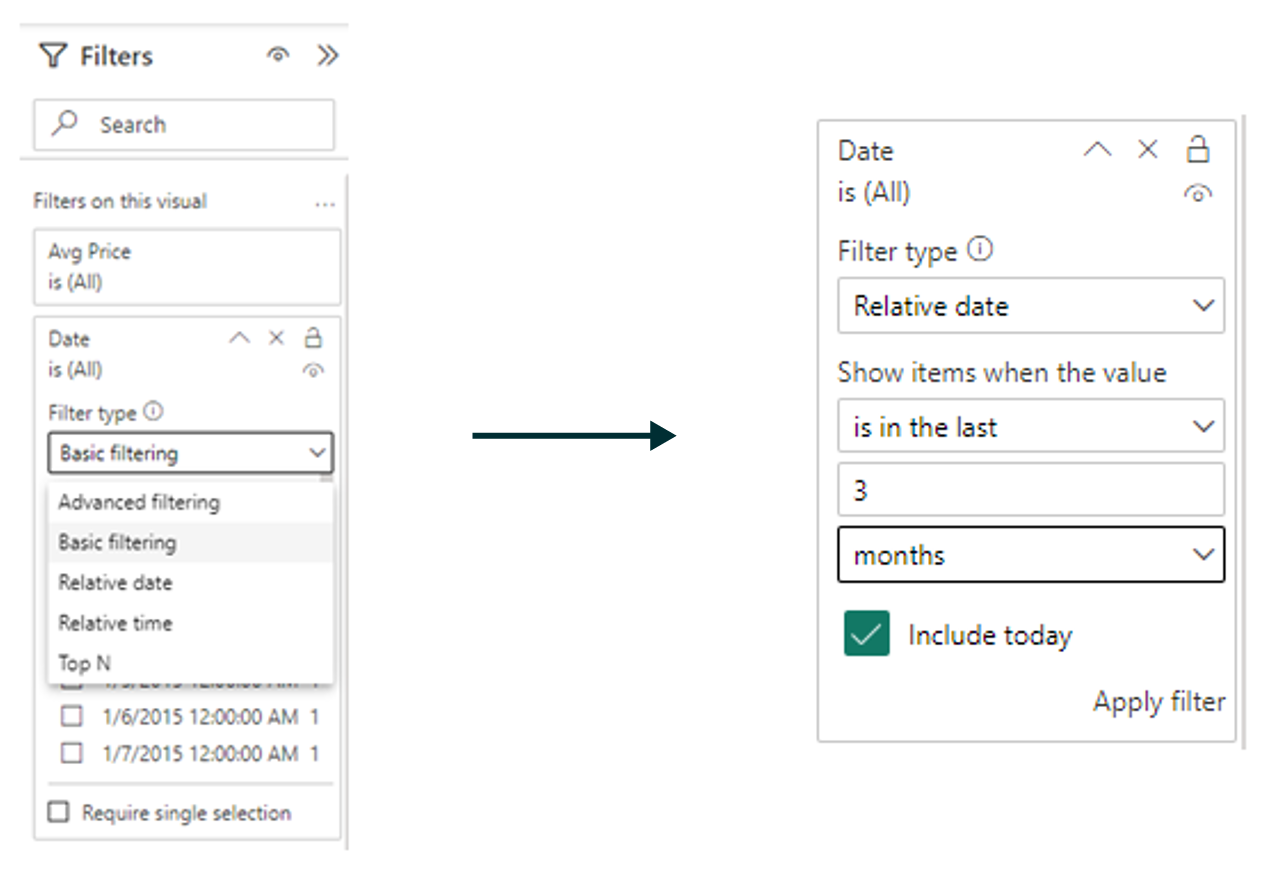
By incorporating a date column into the filter panel, users can toggle the filter type to Relative Date, granting them control over parameters such as the last, current, or next period, the number of periods, and the specific period type (day, week, month, year, and calendar periods).
Advantages
- Provides dynamic relative period filtering.
- No need to update periods as the last period available is automatically selected.
Drawbacks
- This filter will not be shown on the report page, but in the right filter pane, which in some cases might be hidden by the developer to limit the interaction of users with some filters.
- It lacks the flexibility to switch seamlessly between relative and regular date filtering without having to remove or deactivate the relative date filter. Relative date filtering filters out non-selected dates.
‘Last Period’ Workaround
This is an earlier workaround that we implemented for the same use case, and although it has some downsides it’s still a valid solution.
In this workaround, we use DAX’s TODAY() function, which solves many of our problems in creating a dynamic filter. As we now have a way to automatically get the current date, we can use it to calculate which periods in our date table are the last occurrences.
In our example, we wanted to give users the ability to automatically filter reports by the last twelve months in the Date table. The key to achieving this lies in the following DAX formula, which allows us to determine if a specific month, let’s say March, is the last March in the Date table. If this condition is true, we will save this as “Last March” in a new column. If it isn’t, we will save it as “March YYYY” in the new column, where YYYY corresponds to the year.
Here’s the DAX code to generate this new column:
IF(
    (MONTH('Date'[Date])<=MONTH(TODAY()) && YEAR('Date'[Date])=YEAR(TODAY()))     ||     (MONTH('Date'[Date])>MONTH(TODAY()) && YEAR('Date'[Date])=YEAR(TODAY())-1),
    CONCATENATE("Last ", 'Date'[Month Long Name]),
    'Date'[Year Month]
)
The last step is simply to add the new column to a slicer:
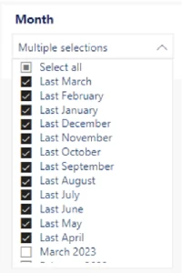
The idea here is that the users won’t have to update the slicer manually. The same values (“Last January” to “Last December”) will always be selected, but the rows assigned to these values in the Date table will dynamically change thanks to the TODAY() function.
We could also create a new column in the Date table and use it in the Sort by column option so the “Last month” and “Month YYYY” appear in the correct order as in the example above. For example, we could use:
Month Selection Order = YEAR('Date'[Date])*100+MONTH('Date'[Date])
This formula converts the date to an integer, allowing us to order our new column effectively.
Advantages
- Allows users to apply relative filtering directly on the report page using a slicer.
- The periods update automatically.
- Users can still filter by a previous month if necessary.
Drawbacks
- The slicer will now show two different date formats, which might be confusing for a user without previous training on the report’s functionalities.
- It doesn’t provide a straightforward option to change between periods (for example, from months to years) without significant modifications.
Power BI Custom Visuals
The last alternative we explored was Power BI Custom Visuals, which can be browsed in the Microsoft marketplace. While there are many options and some of them offer excellent features, we found them challenging to implement in a production environment for several reasons.
Advantages
- May offer functionalities and features that aren’t included in Power BI’s built-in slicers.
Drawbacks
- The fact that they are developed by third parties raises several concerns, such as data security, potential discontinuity or lack of maintenance, and incompatibility with newer Power BI features.
- The visual design often doesn’t align with the overall report theme.
- Lack of flexibility.
Our Solution – Dynamic Date Slicer Workaround
Bearing all this in mind, we developed a clever workaround for these situations. Our solution allows us to set a range of dates to filter in the report, which will update daily without requiring any user interaction.
Let’s see how to set it up, step by step.
1. Filter Table:
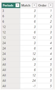
First, we need to create a custom table with the periods we want to dynamically select. Let’s call it “Filter table”. In our example, we’ll configure the workaround to allow selection of the last 3, 6, 12, or 24 months, with an option to select all dates as well. Using this approach, you can define various periods based on days, months, or years—the possibilities are limitless.
To create this table, we’ll select “New Table” in the Table View ribbon and, with a DAX formula, create a table with three columns: Periods, Match, and Order.
The DAX formula used in our example is as follows:
Filter_Table =
DATATABLE (
    "Periods", STRING,
    "Match", INTEGER,
    "Order", INTEGER,
    {
        {"3", 3, 1},
        {"6", 3, 2},
        {"6", 6, 2},
        {"12", 3, 3},
        {"12", 6, 3},
        {"12", 12, 3},
        {"24", 3, 4},
        {"24", 6, 4},
        {"24", 12, 4},
        {"24", 24, 4},
        {"All", 3, 5},
        {"All", 6, 5},
        {"All", 12, 5},
        {"All", 24, 5},
        {"All", -1, 5}
    }
)
And the result should look something like this:
The resulting columns will serve the following purposes:
- Periods: This column will contain the values selectable in the slicer. Note that if we select “Last six months”, this option will also include the dates from “Last three months”, so we need to create two separate rows, each with a different key.
- Match: This column will contain the keys used to join this table with the Date table, which we will create later.
- Order: This column will help display the options in the desired order within the slicer. To do so, select the Periods column, click on Sort by column, and then choose the Order
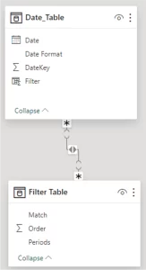
2. Date Table:
The next step is to create a “Date” table that acts as the dimension table in our model. With the following DAX code, we can create a dynamic Date table that will generate dates from a selected start date (in our example, 01/01/2015) until the end of the current month:
Date_Table =
VAR FirstFiscalMonth = 1 -- First month of the fiscal year
VAR FirstSalesDate = DATE(2015,1,1)
VAR LastSalesDate = EOMONTH( TODAY(), 0 )
VAR FirstFiscalYear =
    YEAR ( FirstSalesDate )
    + 1 * ( MONTH ( FirstSalesDate ) >= FirstFiscalMonth && FirstFiscalMonth > 1)
VAR LastFiscalYear =     -- Customizes the last fiscal year to use
    YEAR ( LastSalesDate )
    + 1 * ( MONTH ( LastSalesDate ) >= FirstFiscalMonth && FirstFiscalMonth > 1)
RETURN
GENERATE (
    VAR FirstDay =
        DATE (
            FirstFiscalYear - 1 * (FirstFiscalMonth > 1),
            FirstFiscalMonth,
            1
        )

    VAR LastDay =
        DATE (
            LastFiscalYear + 1 * (FirstFiscalMonth = 1),
            FirstFiscalMonth, 1
        ) - 1
    RETURN CALENDAR ( FirstDay, LastSalesDate),

    VAR CurrentDate = [Date]
    VAR Yr = YEAR ( CurrentDate )       -- Year Number
    VAR Mn = MONTH ( CurrentDate )      -- Month Number (1-12)
    VAR DateKey = Yr*100+Mn
    RETURN ROW (
        "DateKey", INT ( DateKey ),
        "Date Format", LEFT(DateKey, 4) & "/"& FORMAT ( CurrentDate, "mmm" ) & "/" & RIGHT(DateKey, 2),
        "Year Month", FORMAT ( CurrentDate, "mmmm yyyy" ),
        "Filter",
        SWITCH(
            TRUE,
            DATEDIFF([Date], TODAY(), MONTH)<3, 3,
            DATEDIFF([Date], TODAY(), MONTH)<6, 6,
            DATEDIFF([Date], TODAY(), MONTH)<12, 12,
            DATEDIFF([Date], TODAY(), MONTH)<24, 24,
            -1
        )
    )
)
We can tune this DAX code to include all kinds of fields that could be useful for our report, such as Day, Year, Month, Month Number, Year Number, Dates in another format, etc.
Let’s focus on the last column of this table created with the DAX query:
"Filter",
 SWITCH(
     TRUE,
     DATEDIFF([Date], TODAY(), MONTH)<3, 3,
     DATEDIFF([Date], TODAY(), MONTH)<6, 6,
     DATEDIFF([Date], TODAY(), MONTH)<12, 12,
     DATEDIFF([Date], TODAY(), MONTH)<24, 24,
     -1
 )
This column will be the key used to join this table with the Filter table.
Now we will be able to join these two tables in the Model View ribbon. The relation will be “many-to-many”, but it won’t have any impact on the report as the filter table won’t be joined to any other table:
3. Visualisation Tuning:
Next, we will create the shapes and visualisations that will configure the slicer:
- Two buttons: Custom and Top N
- Two slicers: Year Month and Period
- One shape: Date
In the Year Month slicer, we add the corresponding field from our Date table. We’ll set this slicer as a dropdown and enable the Select all option:
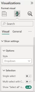
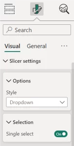
For the Period slicer we will use the corresponding field from the Filter table. This slicer will also be a dropdown, but with the Single select option activated:
4. Bookmarks and Final Tunings:
Next, we will create the bookmarks to be linked to the buttons. We will create two bookmarks: “Custom_Date_Bookmark” and “TopN_Date_BookMark”. We will right-click on each bookmark and select DATA, DISPLAY, CURRENT PAGE, and SELECTED VISUALS. It is crucial to select the DATA option, as this ensures that hidden visualisations reset to the All option when the bookmark is activated. Without this, the workaround will not work properly.
Creating bookmarks can be tricky, so don’t hesitate to take a look at the official Microsoft documentation if you have any doubts.
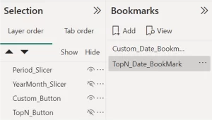
Then, in the Selection ribbon, we’ll hide the Top N button and the Year Month slicer (ensuring the All option is selected beforehand), and then update the “TopN_Date_BookMark” bookmark. The result should look like this:
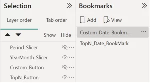
After this, we’ll hide the Period slicer (previously selecting All) and the Custom button. Then, we will unhide the Top N button and the Year Month slicer and update the “Custom_Date_Bookmark” bookmark:
The next step is to configure the buttons; you can set the statical options as you please. We have opted for separate buttons, but you could also group the two bookmarks and use the Bookmark navigation feature. The key point here is to activate the Action option, set the type to Bookmark, and select the corresponding bookmark for each button. This means “TopN_Dates_BookMark” for the Top N button and “Custom_Dates_Bookmark” for the Custom button.
The main idea here is to use the Select all options of both slicers:
- When we click on the Top N button, we will see the Period We can set it to appear with the period we want, but the hidden Year Month slicer will be set to “All”:
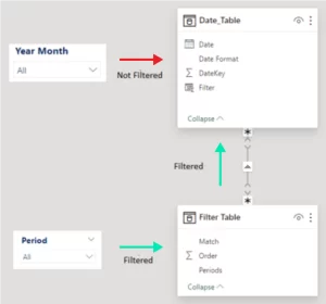
- When we click on the Custom button, we will see the Year Month We can set it to appear as we want, but the hidden Period slicer will be set to “All”:
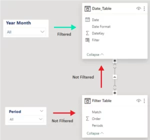
With this setup, we can apply filters from one slicer to the Date table without the other slicer affecting it. Additionally, we can hide the All option in the Period slicer when it is visible, but it must be selected before it is hidden.
The final step is to arrange all the components together. Using the Date shape as a base, we positioned the buttons and slicer in the exact same spot, creating the appearance of a single, cohesive visualisation. The result should look something like this:
Conclusion
Power BI is a great tool for data visualisation, and it offers us endless possibilities. However, we must give user experience the importance it deserves, because it doesn’t matter how innovative a report is if nobody’s going to use it!
We came up with the idea for this workaround when a customer of ours needed to display information for the last twelve months in a Power BI report while retaining the ability to access unselected months for period comparisons, such as trimesters or years.
With this solution, not only did we meet our customer’s requirement to automatically select the last twelve months while allowing for custom month selections, but we also introduced additional options such as the last quarter, last six months, and last twenty-four months. And the possibilities are endless: we could, for example, also include “Same quarter from the last two years”, enabling users to compare quarters year over year.
This solution is designed to enhance our customers’ reporting by making it more user-friendly and flexible, allowing them to maximise the value of their data. The dynamic component ensures that their visuals are always up to date, without requiring manual adjustments to the filters.
This kind of workaround takes our reports to the next level, and we are committed to exploring new ways to realise Power BI’s full potential in future blog posts. If you are interested in learning more or seeing what Power BI can do for your organisation, don’t hesitate to contact us and our team of experts will be happy to help.