27 Feb 2025 Visual Calculations in Power BI
Although you’re excited when starting to use Power BI, that enthusiasm can wane when it comes to writing your own measures. If you don’t work with Power BI daily or haven’t had much practice with DAX formulas, creating measures can feel challenging: this is where visual calculations can make a real difference.
A visual calculation is a DAX calculation that is defined and executed directly within a visual. Unlike other calculation options, visual calculations are not stored within the data model, but are linked to specific visuals, applying dynamically as data appears or disappears within them.
This allows Power BI users to carry out flexible calculations that are customised for the visual in the report view, enhancing report interactivity and analytical insights.
How to Start Using Visual Calculations
Visual calculations are enabled by default in Power BI versions from September 2024 onwards.
If you’re using an older version, you can activate them in Options and Settings > Options > Preview features. Select Visual calculations, click on OK, and you’re good to go!
To create your first visual calculation, select your visual and click on the New visual calculation button in the Calculations ribbon:
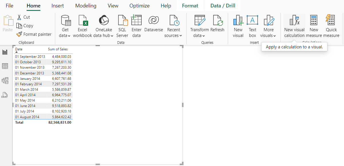
Figure 1: New Visual Calculation Button
In the report view, your screen will be split into two. The top displays your visual, while the bottom is where you can start writing your visual calculation:
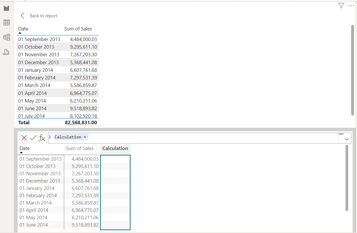
Figure 2: Visual Calculation Bar
Type the text of your visual calculation directly into the text area, or click on fx (function) to see a list all the available templates. You can use these templates for inspiration, or build your visual calculations from scratch:
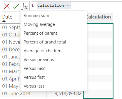
Figure 3: Visual Calculation Templates
The following templates are available for immediate use:
- Running sum: Calculates the sum of values, adding the current value to the preceding values.
- Moving average: Calculates the average of a set of values in a given window by dividing the sum of the values by the size of the window.
- Percent of parent: Calculates the percentage of a value relative to its parent.
- Percent of grand total: Calculates the percentage of a value relative to the overall total.
- Average of children: Calculates the average value of the set of child values.
- Versus previous: Compares a value to a preceding value.
- Versus next: Compares a value to a subsequent value.
- Versus first: Compares a value to the first value.
- Versus last: Compares a value to the last value.
Running Sum
Modelling running sums (cumulative totals) in DAX isn’t always straightforward. It means writing a DAX measure, and understanding these calculations, especially when working with time intelligence functions, can be tricky.
Here’s an example of a measure that calculates a running total:
Measure =

VAR NumMonths = 12

VAR RollingSum =

CALCULATE(

SUM(financials[ Sales]),

DATESINPERIOD(financials[Date], LASTDATE(financials[Date]), -NumMonths,MONTH)

)

RETURN

RollingSum
Figure 4: DAX Calculation of a Running Sum
As you can see, this DAX calculation uses two variables and two functions (CALCULATE and DATESINPERIOD), making it a fairly complex formula.
In contrast, the DAX required for a visual calculation is much clearer. Simply click on the suggested Running sum template, insert the field into the brackets and click on the green Commit button:
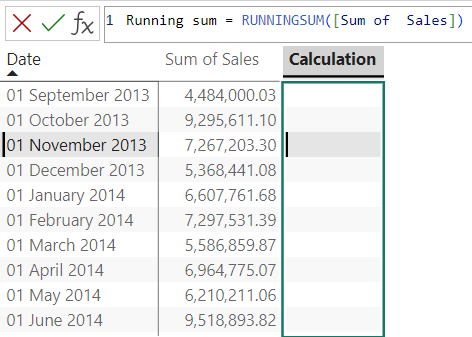
Figure 5: Running Sum Template Calculation
The Running sum calculation will automatically be added to the visual, delivering the same results as the DAX measure presented above.
As you can see, using the Running sum template is intuitive and very practical.
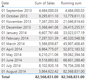
Figure 6: Result of the Running Sum Calculation in the Visual
Moving Average
Another calculation we’d like to highlight in this article is the Moving average. Moving averages help to smooth out chart lines by reducing sharp spikes and drops, making it easier to identify trends in the data over time.
Just like the Running sum example, calculating a Moving average is simple with the available template. Just click on the Moving average template, insert the field into the brackets, and click on the green Commit button:
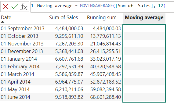
Figure 7: Moving Average Calculation
The resulting calculation will automatically be added to the visual:
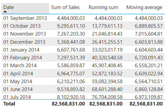
Figure 8: Result of the Moving Average Calculation in the Visual
Calculations Defined Directly on Visuals
As we mentioned earlier, this feature allows you to define calculations directly on visuals. Any field from the data model must first be added to the visual before a visual calculation can reference it. Once you’ve created visual calculations, you can combine them to build additional chart measures.
In our previous examples, we added the Running sum and Moving average calculations to our visual. Now that they have both been added, we can use them to construct new visual calculations, just by typing their names in the calculation bar:
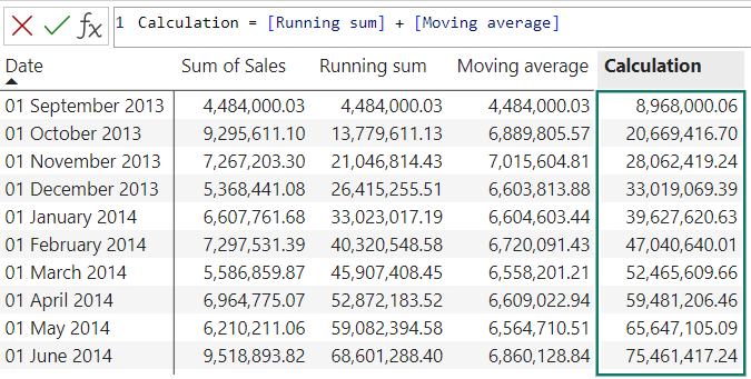
Figure 9: Easily Combine Visual Calculation Results to Create a New Calculation
Hiding, Formatting & Renaming Visual Calculations
When you create a new visual calculation, it is automatically added to the Columns section in the Visualizations pane.
If you need to edit the syntax of the calculation, just navigate to the pane, locate the visual calculation and click on Edit calculation. The visual calculation text bar will appear inside the report view again, allowing us to apply the necessary changes.
We can also rename our calculation, hide it from the visual, or apply some formatting:
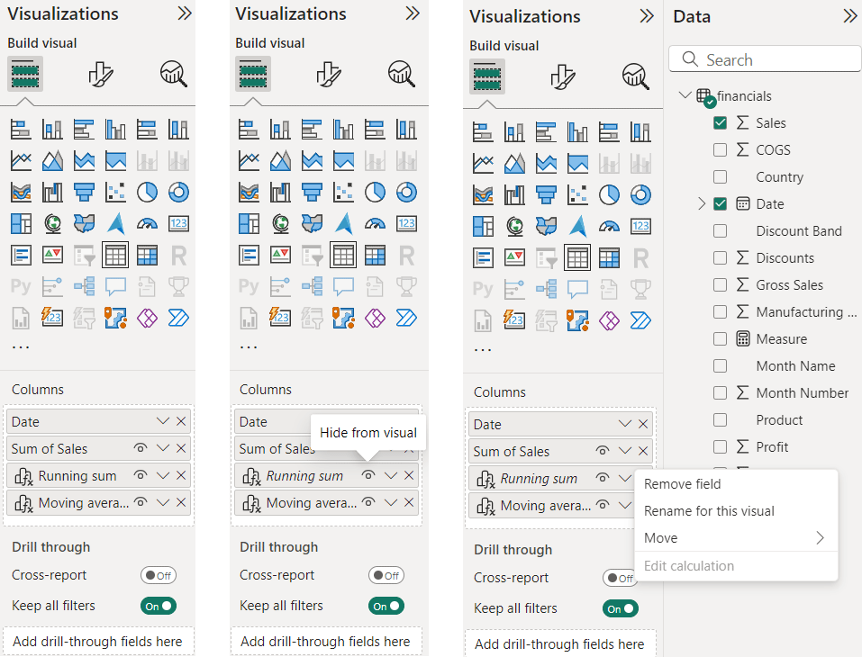
Figure 10: Visual Calculations Available for Editing in the Visualizations Pane
Conclusion
Visual calculations are a new Power BI feature that make it easier to generate complex metrics, without the need to write intricate DAX formulas. While DAX is a powerful and functional language, certain concepts can be challenging for report creators who are just getting started with Power BI.
With visual calculations, you can incorporate context, detail, and specific analytical insights directly into your reports, without adding complexity to the data model with single-use measures.
Visual calculations simplify the creation of complex metrics that were previously difficult to implement. Since they only reference the data displayed in the visual, you don’t need to navigate the complexities of filter context, making calculations easier. What’s more, they operate on aggregated data rather than the detail level, leading to improved performance and more efficient report processing.
Our team of experts has deep technical knowledge and hands-on experience in building high-performance Power BI solutions tailored to specific business needs. If you want to get the most out of visual calculations or need expert guidance in Power BI, simply contact us today and we’ll be happy to help you!