19 Feb 2025 Maximising Power BI’s Potential with Synoptic Panel
We all know how important it is to present information in a clear, intuitive, and visually compelling way, and Power BI’s rich suite of built-in visuals enables businesses to transform raw data into just that. However, when something highly customised is needed, native Power BI visuals can fall short, and this is where OKVIZ’s Synoptic Panel steps in. As a certified custom visual, it offers a flexible and tailored approach to data representation, offering new possibilities that built-in visuals simply can’t match.
The Importance of Certified Custom Visuals
As Power BI users, we often encounter scenarios where the default visual elements don’t meet our specific needs. Built-in visuals are effective for common use cases, but their customisability is limited. Synoptic Panel from OKVIZ is a certified custom visual that fills this gap by offering an advanced solution for mapping and data visualisation. With Synoptic Panel, we can visualise data in any custom shape or map, providing a level of interaction and detail that standard Power BI visuals doesn’t offer. This flexibility allows us to design and tailor visuals that suit the unique structure of our datasets and business needs.
Key Features and Utilities
The power of Synoptic Panel lies in its ability to integrate seamlessly with Power BI whilst providing enhanced customisation options. Through Synoptic Designer, we can easily create custom shapes and maps which can then be imported into Power BI for visualising data. Whether we need to represent organisational structures, geographical maps, or floor plans, Synoptic Panel allows us to define and customise every element.
This versatility is particularly valuable when working with spatial data. While Power BI’s built-in maps offer basic functionality, Synoptic Panel takes it a step further by allowing us to visualise data points on custom images. Businesses can now display data in context, providing deeper insights. As OKVIZ says, “It’s not just a map. It’s any shape you want it to be”.
Moreover, Synoptic Panel supports conditional formatting, interactions, and drill-through capabilities, ensuring that the visualisation is not only aesthetically pleasing but also practical and informative. The ability to drill into specific areas of a custom visual, based on the data, gives us more control over the user experience, helping us to extract insights faster.
Unlocking Potential Beyond Built-in Visuals
Power BI’s built-in visuals come with limitations, especially when it comes to visualising complex or non-standard datasets. For instance, Power BI’s default map visuals can display geographical data, but they don’t work with custom shapes or regions. Similarly, standard chart types may not always capture intricate relationships within the data. This is where Synoptic Panel excels.
OKVIZ’s Synoptic Designer lets us create interactive visuals to represent any custom area, visualising data in the way that best suits our business model. Whether tracking performance, monitoring operations, or analysing complex systems, Synoptic Panel can provide a more meaningful, precise representation.
Imagine we need to reorganise and monitor a warehouse based on inventory turnover. With Synoptic Panel, it’s easy. In this scenario, we’ll use an existing element from the gallery, but we could also upload a custom image and map each area by dragging and dropping:
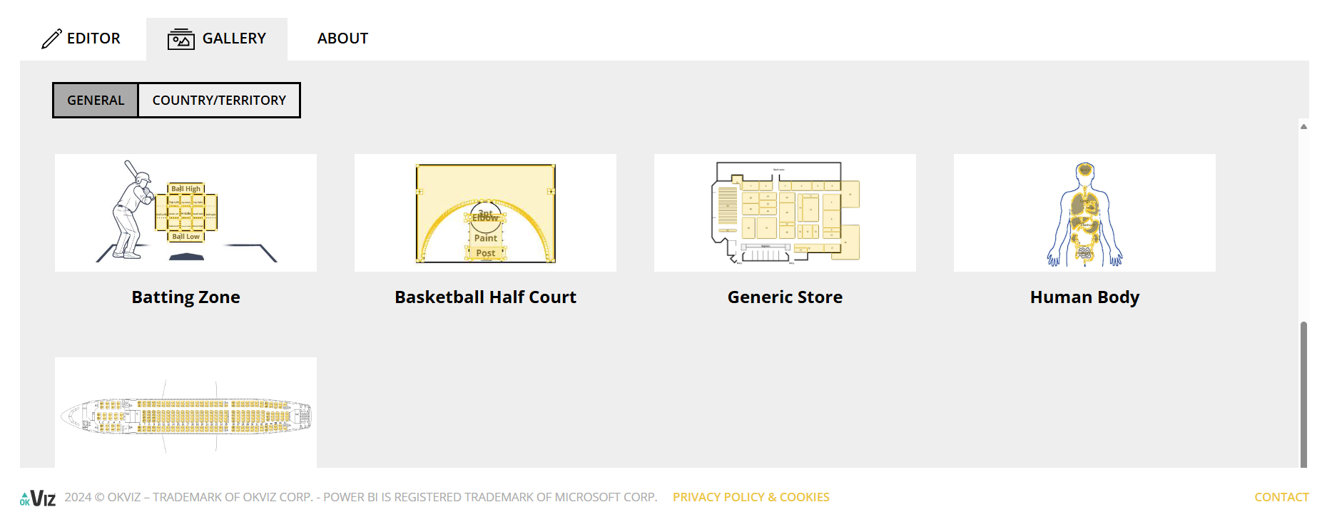
Figure 1: Synoptic Panel Gallery
Once in editing mode, we can name and define each area in the Areas pane. To ensure proper mapping, the Area names must match those in the dataset:
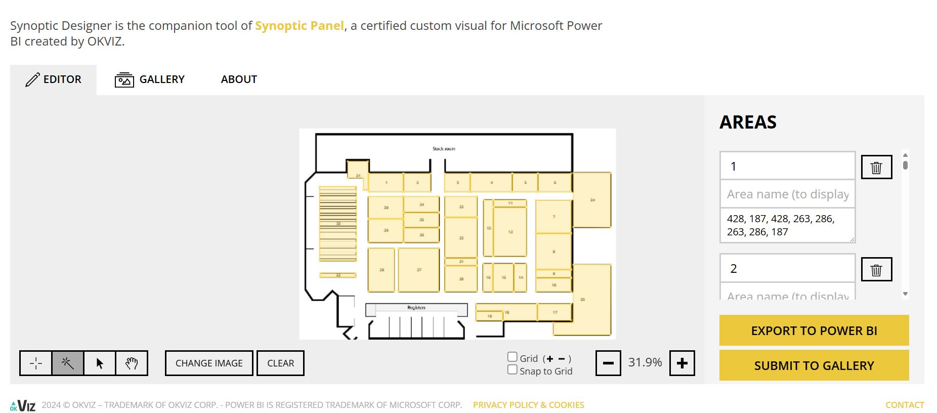
Figure 2: Synoptic Panel Editor
For this example, we’ll classify the inventory turnover into three categories:
- Green: Turnover greater than 8.
- Yellow: Turnover between 4 and 8.
- Red: Turnover less than 4.
To do this, we drag the Storage unit field to Category, Turnover category to Subcategory, and Inventory turnover to Measure. Then, in the Format pane under Data Colors, we set the appropriate colours for each Turnover category: green, yellow, and red. Finally, we enable Data labels so that Synoptic Panel displays the Storage unit values in the visual:
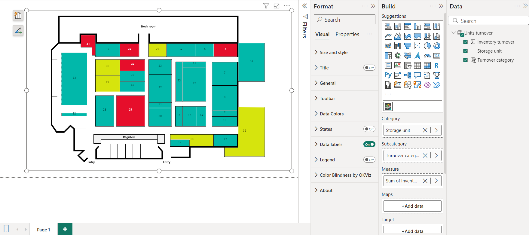
Figure 3: Synoptic Panel Used in Power BI
Now we can see this classification applied to the actual warehouse floor plan, and take actions to reorganise stock in each storage unit, ultimately optimising our operations.
Limitations to Consider
While Synoptic Panel is powerful, it is important to recognise that it requires more effort and expertise to set up than standard visuals. Designing custom visuals through Synoptic Designer can be time-consuming, particularly if we do not have predefined images or maps to work with. Additionally, for businesses that require rapid visualisations with minimal customisation, the learning curve associated with custom visuals may pose a challenge. Nevertheless, for users seeking a highly tailored approach to data visualisation, the benefits far outweigh the initial setup time.
Conclusion
In conclusion, while Power BI’s built-in visuals provide a solid foundation for data visualisation, they are often insufficient for handling complex, customised datasets. OKVIZ’s Synoptic Panel bridges this gap, enabling us to visualise data with unmatched precision and flexibility.
By embracing certified custom visuals like Synoptic Panel, we can unlock Power BI’s full potential, delivering insights that drive better decision-making across our business. With its extensive customisation options, businesses can transform how they interact with their data, moving beyond the limitations of built-in visuals to create more dynamic, engaging reports.
If you’re ready to take your visualisations to the next level, contact us to learn more about how we can help you integrate this powerful tool into your reports.