
19 Feb 2025 Exploring Q&A Visuals in Power BI
What if you could explore your data simply by talking to Power BI? That’s exactly what the Q&A feature has been designed for. It lets you create visuals and get insights from your data using your own words. Just ask a question, and your data will answer back.
Besides being a great way to analyse your data with natural language, it also allows you to turn relevant answers into standard visuals. In this article we’ll see how to enable the Q&A feature, what it looks like in practice, and how to optimise it for better answers.
Getting Started
Enabling the Feature
We can access Power BI Q&A in two different ways:
- Q&A Button: Go to Insert > Buttons > Q&A
- Q&A Visual: Either go to Insert > Q&A, then select the Q&A icon in the visualisation pane, or double-click on the empty space in the report:
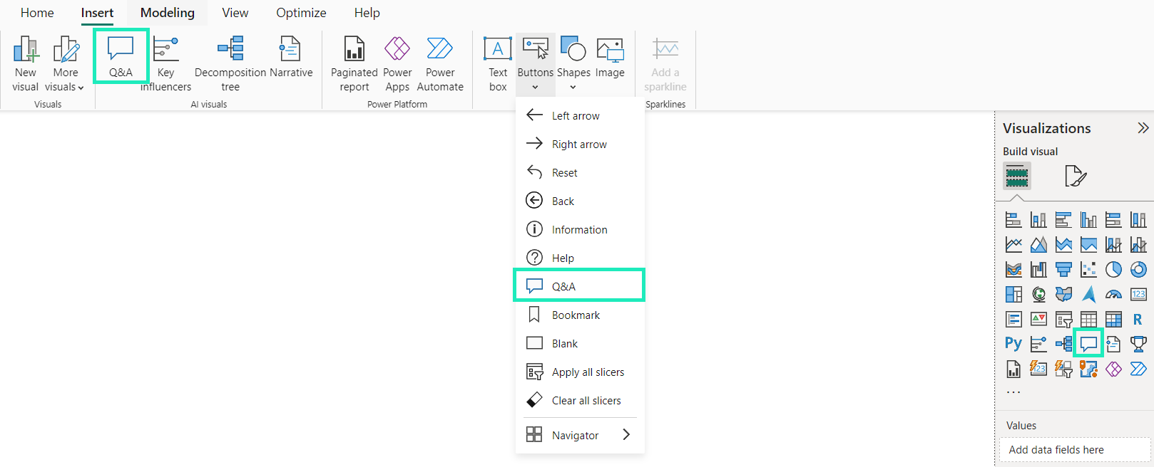
Figure 1: Enabling the Q&A feature
Note: Q&A is only accessible to a report viewer if the report creator has enabled it in one of these two ways. However, there is a difference between these two options: the Q&A button will only give you access to the feature through a pop-up window in your report, whereas the Q&A visual appears directly on the report page as a visual. This includes the Q&A setup and allows you to turn an answer into a standard visual.
In this article, we’ll focus on the Q&A visual, which is the more comprehensive, feature-rich option.
Here’s what it looks like once created:
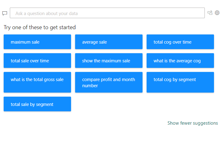
Figure 2: The Q&A visual in its default state
As you can see, the visual is pretty intuitive: you can either type your own question or choose one of the suggestions. Directly to the right of the question field, you’ll find two icons – the first icon allows you to turn a satisfactory answer into a standard visual, and the gear icon gives you access to the Q&A setup (we’ll look at this in more detail later).
For context, we’ll be using the Financial Sample Excel workbook for Power BI in this report.
Asking Questions in Power BI
Now let’s check out the Q&A visual in action! We’ll start by choosing one of the suggested questions:
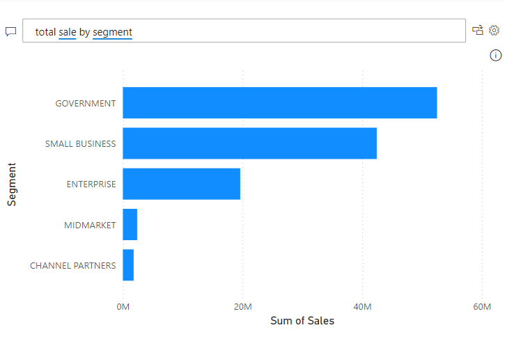
Figure 3: Q&A result from a suggested question
This is a simple example, but we can see that Q&A understood the assignment perfectly. It underlined the terms related to our data model in blue and chose a fitting visualisation to best display the result.
Now let’s ask something more specific. We could, for example, refine our question to see sales by segment and product, only filtering for the year 2013, and showing the result as a column chart instead of a bar chart:
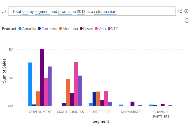
Figure 4: Q&A result from a more specific prompt
We can see that Power BI once again understood the prompt without a problem. However, understanding can vary depending on word order. If we apply the year filter at the end of the question, it may introduce ambiguity:
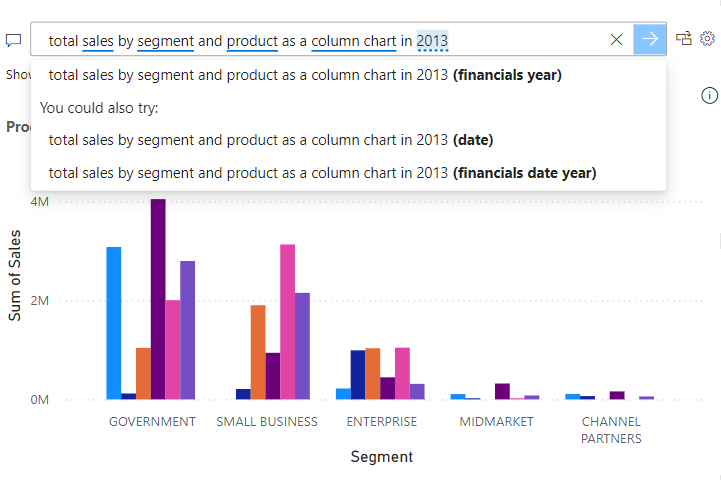
Figure 5: Ambiguous result from a similar prompt
As you can see, now there’s a dotted blue line under 2013, indicating that Power BI found the prompt ambiguous. In this example, it shows several ways to filter for that year (Year column, Date column, Year level within the Date hierarchy), and although there would be no difference in Q&A’s answer in this case, remember that in other contexts, different interpretations could lead to varying results.
Another useful feature is the ability to filter for several specific values using a “where attribute is X or Y” syntax, as shown below:
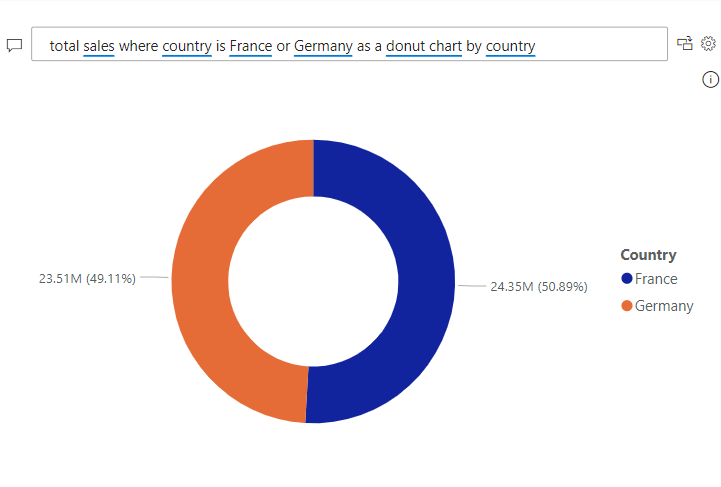
Figure 6: Q&A result when filtering for several values
Note that the data category also influences which type of visualisation Power BI selects by default. For example, with countries correctly labelled as “Country” in the list of data categories, Q&A automatically returns the result as a map (if no other visual is specified):
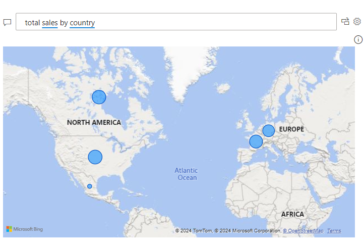
Figure 7: Q&A choosing a fitting visual for our context
In addition to what we’ve just covered, Q&A also offers data comparison (e.g. sales vs profit), result sorting, complex aggregations (e.g. average, median), relative dates (e.g. last month), and Top N queries.
Right now, the Q&A feature seems pretty powerful as it is, doesn’t it? Nevertheless, if we start asking more complex questions with words Power BI doesn’t yet understand, it will struggle to return relevant results. This is where the Q&A setup comes into play, allowing us to train Q&A to return better results. As the report creator, you can access setup by clicking on the gear icon to the right of the question field. It should look like this:
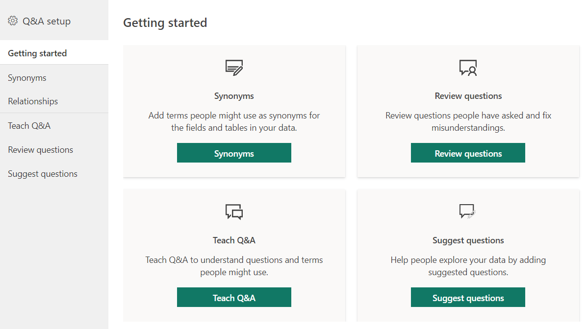
Figure 8: The Q&A setup default view
As you can see, there’s a handy overview of the different ways we can improve Q&A to answer questions about our data. Let’s explore each section, starting with Synonyms.
Optimising Q&A
Adding Synonyms
Let’s ask Power BI for the total cost of goods sold by product, for instance:
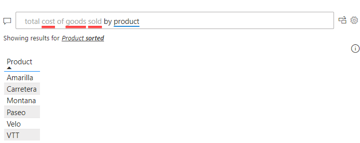
Figure 9: Irrelevant Q&A result
Instead of the expected result, we get a few words underlined in red and an unrelated output—a sorted list of products. Why has this happened? Even though COGS exists in our data model, Power BI doesn’t automatically recognise it as Cost of Goods Sold.
To understand why, let’s take a look at the Synonyms section:
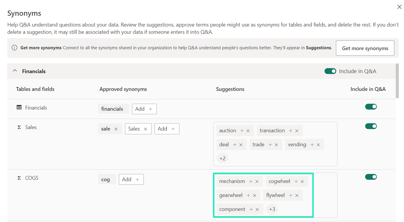
Figure 10: Default Synonyms section
We can see that Q&A thinks of COGS in a mechanical sense, rather than recognising it as a financial concept, so there was no way we were going to get the right answer to our question.
To resolve this, there are three actions we can take in the Synonyms section:
- Adding relevant synonyms from either the suggested list or by entering words that we know to be correct.
- Removing incorrect suggestions, otherwise Q&A will continue to relate them to the main word, even if they are not approved synonyms.
- Enabling synonyms sharing to sync suggested terms in our organisation, allowing us to receive more relevant suggestions and to share our own.
When it comes to managing synonyms, it’s not necessary to add every word we can think of. A few key terms will suffice, as Power BI dynamically updates suggestions based on approved words. If we use a suggested word in a question, Q&A will underline it with blue dots and suggest linking it to the main word. We can then decide to accept the suggestion, and Q&A will display a relevant visual.
Here’s what our updated Synonyms section now looks like:
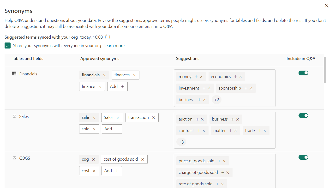
Figure 11: Updated Synonyms section
As you can see, we enabled synonym sharing, added a few relevant synonyms, and removed irrelevant suggestions. Notice how Q&A has updated the suggestions for COGS, now that it understands its financial context. Of course, we would need to do the same for the rest of the attributes, but you get the idea!
Speaking of COGS, here’s what our Q&A visual displays with the updated synonyms:
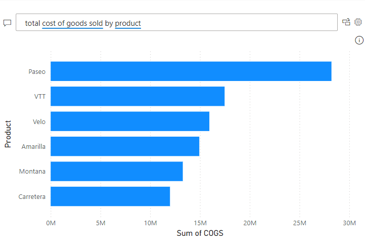
Figure 12: Correct Q&A result for COGS
Q&A now understands the question and shows us a relevant visual. Next up, let’s check out the Relationships section.
Note: If using Copilot, it can provide additional synonym suggestions with generative AI. While Copilot aims to be a more general assistant by making reports easier to create, it also has a feature in preview (Power BI service only) to answer questions about our data model, using the Q&A engine we’re talking about in this article.
Setting Linguistic Relationships
Power BI already has a basic understanding of our data model, but it may not fully grasp how attributes relate to one another. That’s why Q&A gives us the ability to define specific adjectives, nouns, prepositions and other words that report users might employ in their questions.
Let’s open the Relationships section:
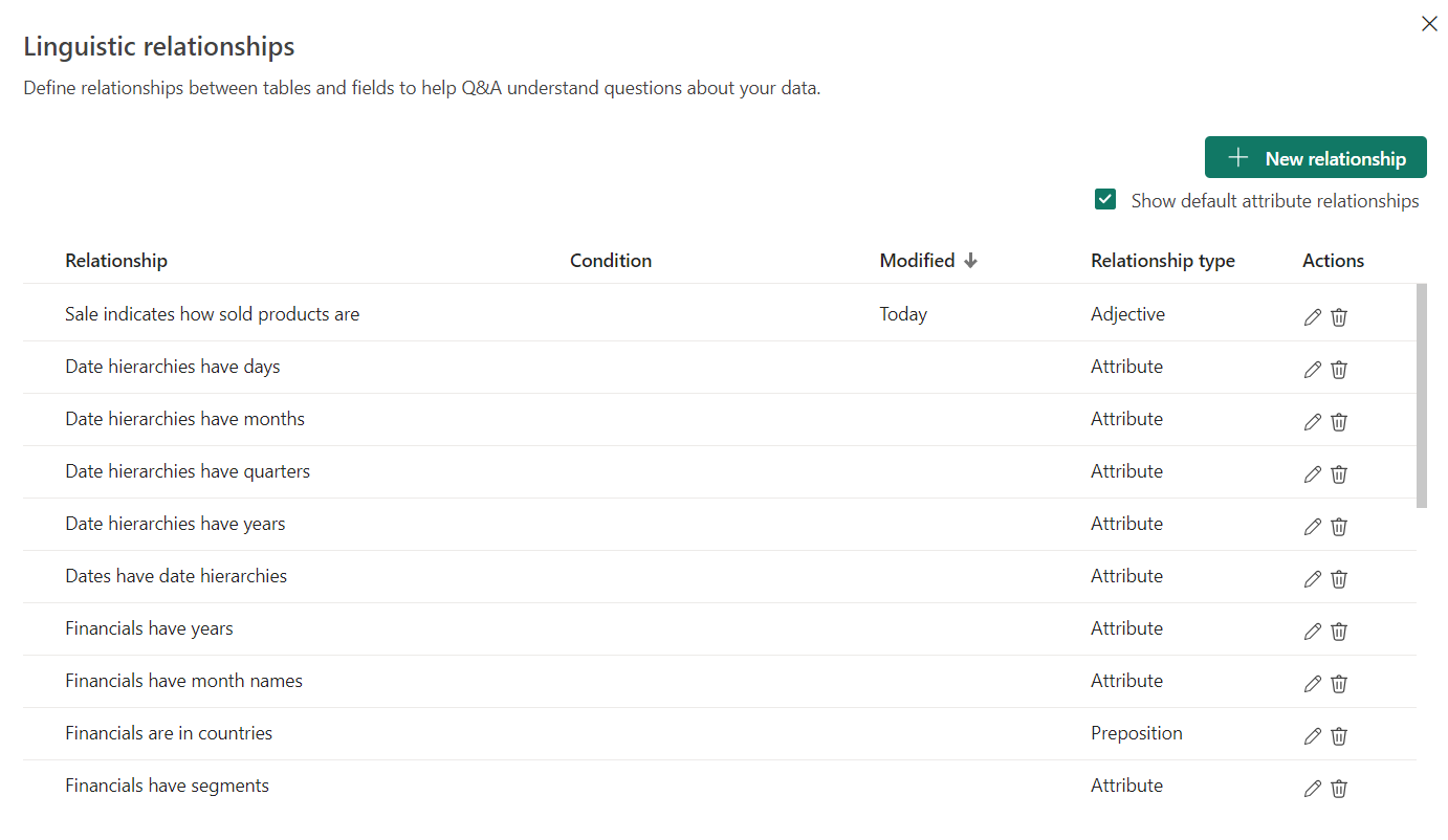
Figure 13: Default Relationships section
Attribute relationships are directly derived from how Power BI interprets our model, but we can also see that a new Adjective relationship has been created. This is because we added sold to the Synonyms section for the word Sales, and Q&A correctly understood it to be an adjective.
Here are the available options when creating new relationships:
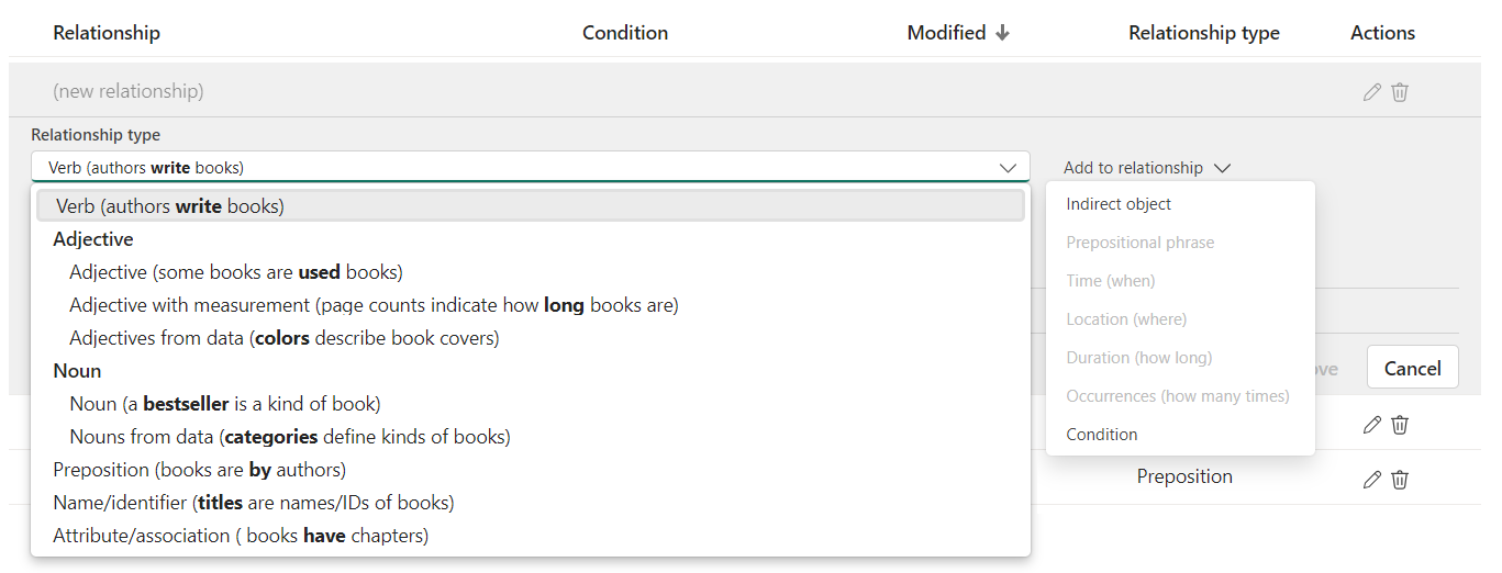
Figure 14: Default Relationships section
As shown above, we can choose from a range of options, including verbs, adjectives, nouns, prepositions, and more. Q&A allows us to further define a relationship with time, location, or duration conditions if necessary.
Let’s create a relationship and see how it works in practice. We’ll define what expensive means, so that report users can ask about how expensive a product is:
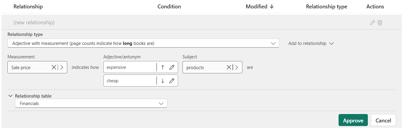
Figure 15: Creating a new relationship
We can now ask questions using the word expensive, and Q&A will know what we’re referring to.
Obviously, it would be time-consuming to think of all the words Q&A may not know and to create a relationship for each one. Instead, we could simply keep asking questions as usual and let Power BI tell us what it doesn’t understand. Let’s see how to do that in the next part.
Teaching Q&A
Here’s what happens when asking Q&A about profitable products:
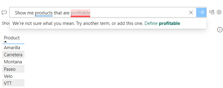
Figure 16: Irrelevant Q&A result
Q&A displays the full list of products and lets us know it doesn’t understand what profitable means.
When we try to define profitable as suggested in the error message, we are directed to the Teach Q&A section of the setup, with our question already typed in. Now all we need to do is provide a clear definition of profitable using a simple condition:
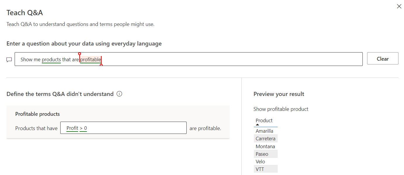
Figure 17: Teaching Q&A a new word
Power BI now understands what profitable means, using a condition directly related to our data model. We can also preview the updated answer: in this case, the result remains unchanged, as all the products in our data model are profitable.
Interestingly, our new definition now appears in the Relationships section:
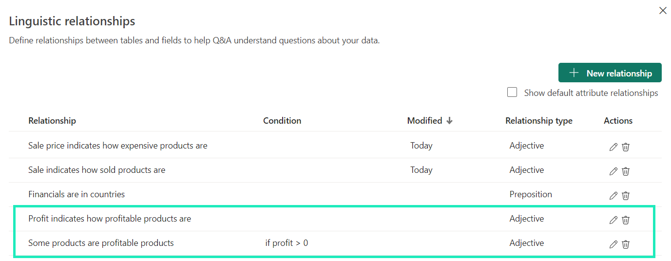
Figure 18: Relationships updated with a new word
This ability to teach Q&A new words based on misunderstandings is extremely useful, but if it’s only the report creator who educates Power BI, the process would be rather slow. Luckily, we can scale it up by getting direct feedback from report users.
Reviewing User Questions
In the Review questions section of the Q&A setup, you can see the questions users have asked over the last 28 days (data is not kept any longer due to privacy reasons), so you can easily improve the Q&A experience by teaching Power BI new words just like we did above. You can see various metrics like question frequency and whether users have requested a fix, allowing you to prioritise as necessary.
Let’s look at the user feedback for our report:
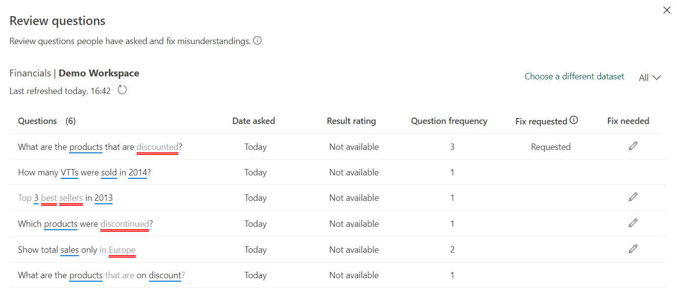
Figure 19: User feedback from the Review questions section
Although Q&A successfully answered two questions, it didn’t fully understand the other requests. The question we can see at the top about discounted products was asked 3 times, and at least one user has requested a fix, so let’s focus on that.
When we click on the pencil below “Fix needed”, it takes us to the Teach Q&A section where we can define the word discounted with a simple condition:
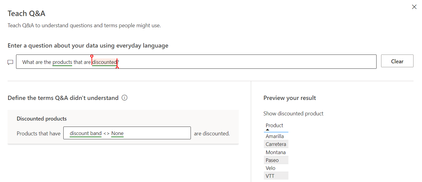
Figure 20: Fixing a question from user feedback
We have successfully taught Q&A the word discounted, which users can now use in their queries. Q&A also gives us a preview of the new result, which still features all products because each has been discounted at least once.
Repeating this process with more user feedback will, over time, greatly improve Q&A’s ability to answer questions about our data.
Suggesting Questions
Lastly, to help users to ask relevant questions and to minimise the risk of misunderstandings, we can update the list of suggested questions that appear below the question field.
Let’s add a few relevant questions to the list:
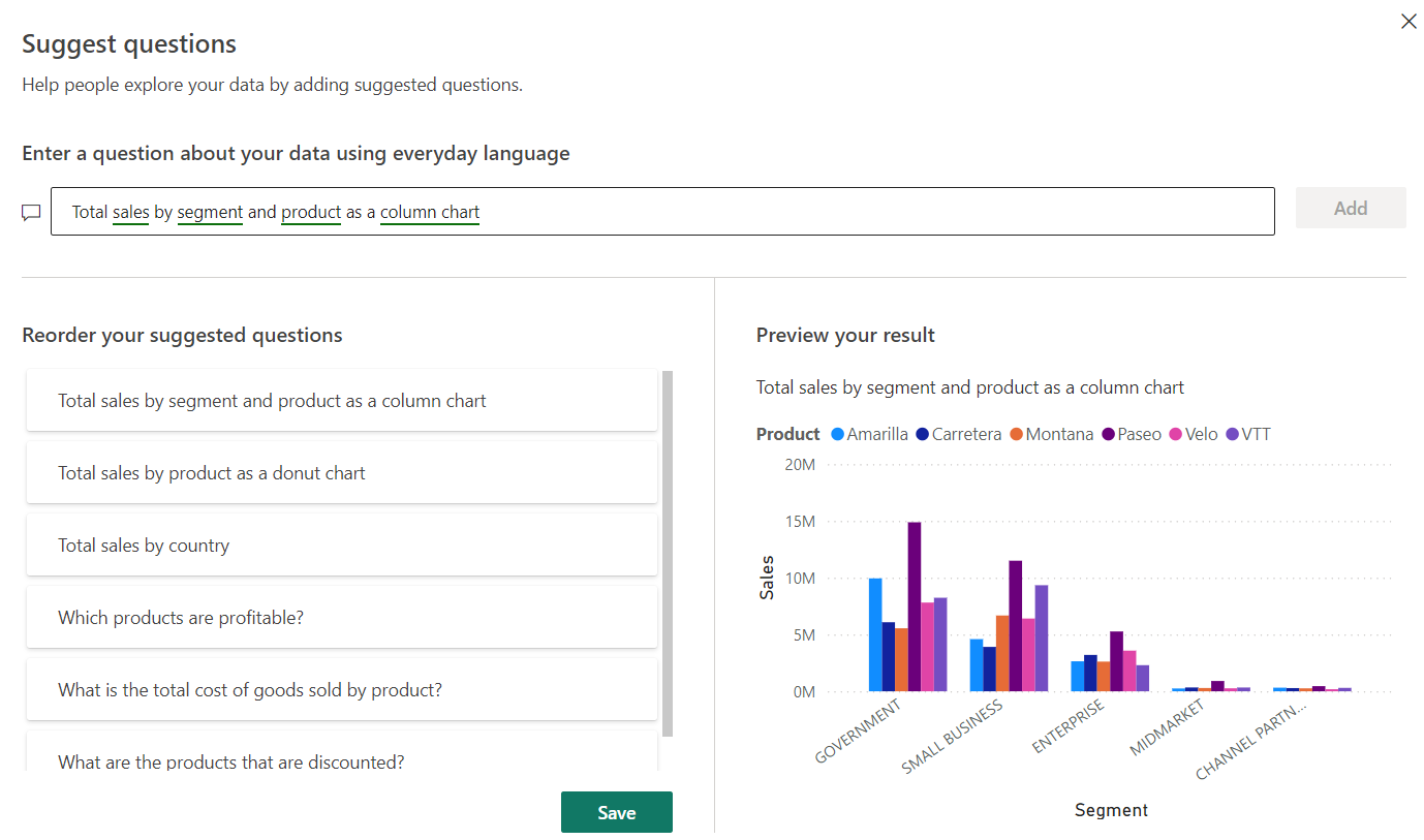
Figure 21: Adding relevant suggestions
Q&A lets us preview the result of each suggested question and reorder them as necessary. Note that once at least one question has been added to the list, it replaces the default suggestions provided by Q&A.
Here’s our updated Q&A with new suggestions for users to choose from:
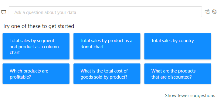
Figure 22: Q&A default view with new suggestions
Conclusion
Power BI’s Q&A is a fantastic feature when set up properly, but the flexibility of natural language also introduces potential misunderstandings, which can impact the user experience.
The usefulness of the Q&A feature ultimately depends on these three factors:
- Report users must actually prefer to use natural language over traditional report interactions.
- Report creators must be willing to set up, refine, and maintain the Q&A experience over time.
- Data model quality is key, as Power BI’s understanding of the data is only as good as the way it is organised.
One thing is for sure: Q&A will only get better and better as its optimisation features evolve beyond preview.
Are you interested in Power BI’s Q&A feature for your organisation? Whether you need help setting it up, optimising your data model, or training it for better insights, our team of experts is here to support you. Contact us now!