17 Abr 2025 Elevate Your Analytics: The Power BI Playbook
Microsoft’s Power BI is one of the most powerful tools for data visualisation available today, but to reap its full potential you need to do more than just understand its features: you must also master a variety of shortcuts, tips, and techniques. This article dives deep into these practical strategies, providing examples to help you take your Power BI skills to the next level, making your day-to-day activities easier and more productive.
Keyboard Shortcuts for Efficiency
Power BI Desktop offers several keyboard shortcuts to help you save time. Here are some essential ones (Fig. 1):
Jupyter magic | Shortcut | |
|---|---|---|
Undo | Ctrl + Z | |
Redo | Ctrl + Y | |
Refresh Data | F5 | |
Switch between report pages | Ctrl + Page Up/Page Down | |
Align objects | Alt + Arrow Keys | |
Show/hide panes (e.g., Fields) | Ctrl + Shift + F |
Fig. 1
Example:
Imagine you’re designing a report and need to align multiple visuals. Instead of dragging them manually, select them all, press Alt + Arrow Keys, and achieve pixel-perfect alignment in seconds.
Performance-Enhancing Techniques for Power BI Reports
Large datasets and complex calculations can slow down Power BI reports, so try these techniques to optimise performance:
1. Optimise Your Data Model
- Star Schema Design: Structure your data model using fact and dimension tables.
- Remove Unused Columns: Avoid importing unnecessary columns into Power BI.
- Disable Auto Date/Time: Go to Options > Current File > Data Load and uncheck Auto Date/Time for large datasets.
Example: Instead of importing a large flat file with thousands of columns, split it into smaller, meaningful tables like Sales, Product, Stores, Customers, etc. (Fig. 2):
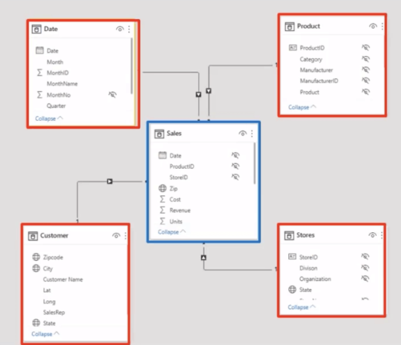
Fig. 2
2. Avoid Redundant Data
Only load the necessary columns and rows into Power BI, and use Power Query to filter out unused data during the ETL process.
Example: If you’re analysing sales data, filter out transactions that are older than five years, unless you need them for specific historical trends.
3. Use Aggregations
Aggregations reduce the amount of data processed by summarising it at a higher level.
Example: Instead of creating a calculated column for profit margins, use the following DAX measure (Fig. 3):
![]()
Fig. 3
4. Optimise DAX Queries
- Avoid using calculated columns where possible; use measures instead.
- Replace CALCULATE with simpler aggregations if applicable.
- Use variables (VAR) to store intermediate results for better readability and performance.
- Avoid using too many nested functions. Instead, simplify queries by splitting them into smaller measures.
- Use tools like DAX Studio to test and optimise your formulas.
Example: Replace this calculated column (Fig. 4):
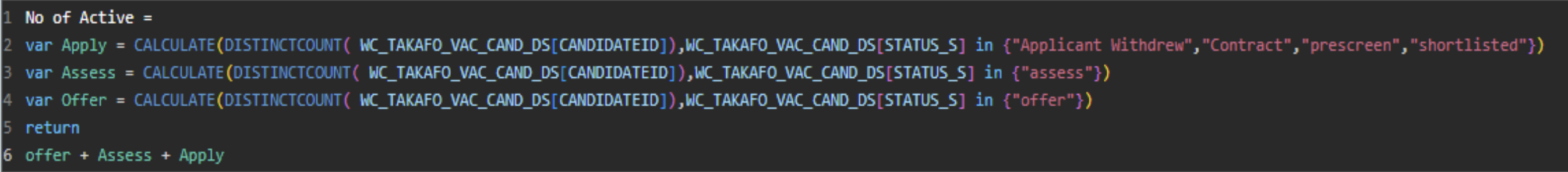
Fig. 4
5. Take Advantage of Time Intelligence
Use built-in time intelligence functions like TOTALYTD, SAMEPERIODLASTYEAR, and DATESBETWEEN to get handy comparisons.
Example: Calculate Year-over-Year (YoY) sales growth (Fig. 5):
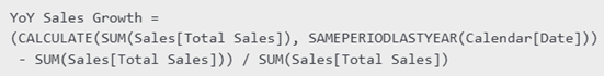
Fig. 5
6. Load Duplicate Tables in the Model
If you want to reuse a table that is already available in the model, instead of creating a new connection with the data source you can follow this simple process:
Step 1: Go to Query Editor.
Step 2: Duplicate the table by right-clicking on it, then on Duplicate table (Fig. 6):
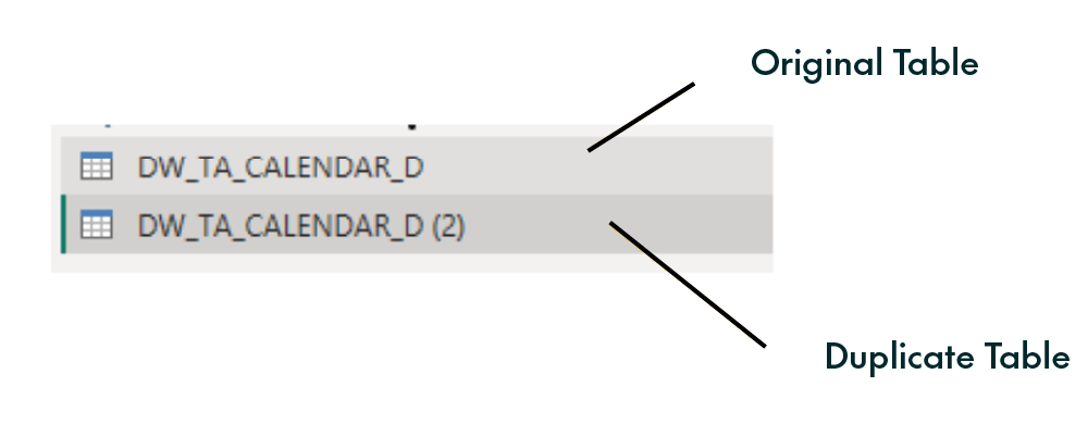
Fig. 6
Step 3: Click on the duplicated table, click on Source in Query Settings, then in the formula bar at the top add your original table name and press Enter (Fig. 7):
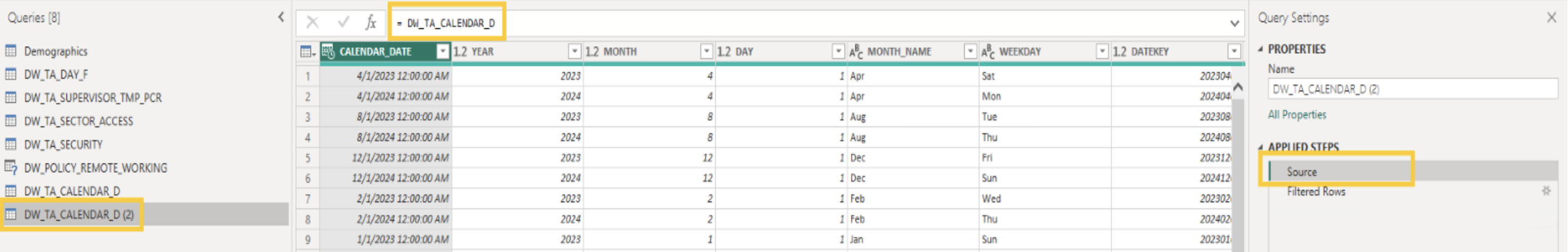
Fig. 7
Now the table will load only once in the model and the refresh time will be significantly reduced.
7. Optimise Data Transformation with Power Queries
Use Parameters for Dynamic Filtering
Parameters make your queries flexible and reusable. For example, you could create a parameter to filter sales data by year or region.
Steps to create a Parameter
Step 1: Go to Power Query Editor > Manage Parameters.
Step 2: Create a parameter named “YearFilter”.
Step 3: Use it in a filter to dynamically load data for specific years.
Automate Column Cleaning
Use the Transform tab to standardise column names, replace errors, and remove duplicates in bulk.
Optimise Applied Steps
Reduce the number of applied steps in Power Query by:
- Consolidating transformations.
- Removing unnecessary intermediate steps.
- Sorting data only when needed.
Example: Combine multiple column-splitting steps into a single transformation.
8. Reduce Visuals per Page
Limit the number of visuals on a single page, as each visual query consumes resources.
Power BI Dataflows
What Are Power BI Dataflows?
Power BI dataflows are a powerful self-service data preparation feature that enables business users and analysts to create reusable data transformation processes. Dataflows are designed to simplify ETL tasks, providing an intuitive visual interface for managing data pipelines without advanced coding skills. They allow users to extract data from multiple sources, clean and transform it, and store it in a centralised location within the Power BI Service for reuse across reports, dashboards, and datasets (Fig.8):
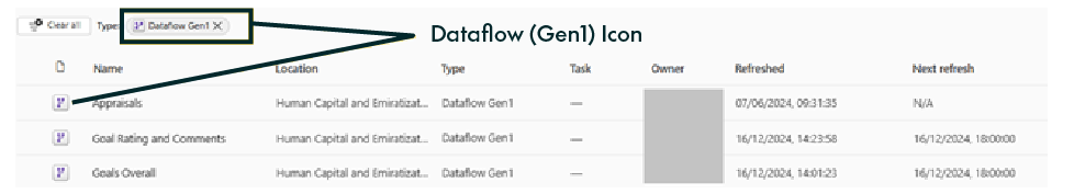
Fig. 8
Key Benefits of Power BI Dataflows
- Reusability: Create reusable data pipelines that can be used by multiple datasets and reports across your organisation.
- Scalability: Transform large datasets without overloading your local machine. With dataflows, all transformations are executed in Power BI Service.
- Enhanced Collaboration: Teams can collaborate on data models by creating and maintaining a centralised data repository.
- Standardisation: Define standardised data transformation rules to ensure consistency in data preparation across different projects.
- Integration with Azure Data Lake: Store dataflows in your Azure Data Lake, integrating smoothly with other Azure services.
Example Diagram of a Power BI Dataflow
Below is a conceptual example of how a dataflow integrates with various data sources and outputs: (Fig. 9)
- Data Sources: The dataflow ingests data from various sources such as SQL databases, web APIs, flat files (Excel/CSV), and online services like SharePoint or Salesforce.
- Data Transformation: Using the Power Query Editor, the raw data is cleaned, reshaped, and prepared for analysis by, for example:
- Removing null values.
- Merging customer data from multiple systems.
- Creating calculated fields (e.g., Profit Margin = Revenue – Cost).
- Storage: The transformed data is stored in a cloud-based storage system, like Azure Data Lake or Power BI’s internal storage.
- Consumption: End-users and analysts consume the prepared data in Power BI Desktop to create dashboards, reports, and visualisations.
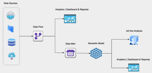
Fig. 9
Tips for Optimising Power BI Dataflows
- Use Incremental Refresh: Enable incremental refresh for large datasets to optimise performance and reduce processing time.
- Use Computed Entities: Create computed entities to perform advanced transformations and reuse them in multiple downstream entities.
- Centralise Transformation Logic: Avoid redundant transformations by centralising common data cleaning logic in dataflows.
- Document Your Data Flow: Use clear naming conventions and annotations to document the purpose of each entity in your dataflow.
- Monitor Performance: Use Power BI Service’s performance-monitoring tools to identify bottlenecks and optimise your dataflow.
Advanced Power BI Visualisation Tips & Techniques
An appealing, intuitive design does a lot to engage the user. Here are some important pointers to follow when developing your reports:
1. Use Themes
Apply consistent themes to match your organisation’s branding. Power BI offers built-in themes, and you can also create your own custom JSON-based themes.
2. Highlight Key Insights
Use conditional formatting to draw attention to critical metrics.
Example: Set revenue KPIs to turn red if they fall below the target, and green when they are above it.
3. User-Interactive Elements
Use slicers, buttons, and drill-through functionalities to create interactive reports that allow users to explore their data dynamically. For example, add tooltips to visuals for additional context without cluttering the dashboard.
4. Use Small Multiples
Small multiples allow you to compare trends across categories in a single visual (Fig. 10):
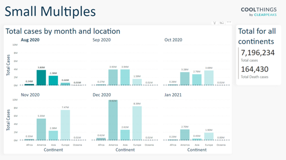
Fig. 10
Conclusions
By adopting these tips and strategies, you can transform your Power BI usage, making it an indispensable tool for data-driven decision-making. Whether it’s optimising your data models, mastering DAX, or managing Power BI Service activities, continuous learning and improvement will set you apart as a Power BI power user!
If you have any questions about what you’ve just read, or would like to know more, don’t hesitate to reach out to our experts here at ClearPeaks and understand how we can help you make the most of your Microsoft and Power BI tech stack.