11 Feb 2025 Oracle Analytics Cloud January 2025 Update Highlights
Welcome to our first Oracle Analytics Cloud blog post of 2025! Oracle has started the year strong, introducing exciting new features and enhancements to its existing capabilities. As always, we remain committed to covering regular OAC releases, ensuring you stay up to date with the latest developments—analysed through the lens of our experts. Let’s dive in!
Load Multiple Sheets Simultaneously
If your primary role is to prepare and load data into OAC for further processing, you’re going to love this update! This enhancement simplifies the process of creating datasets from external files on your local computer, so if your Excel, CSV or Google Spreadsheet file contains multiple spreadsheets, now you can load them simultaneously into OAC.
First, choose Create Dataset from the options and then select a file from your local machine:
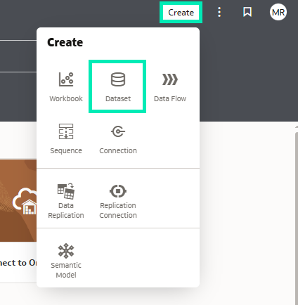
Figure 1: Create Dataset
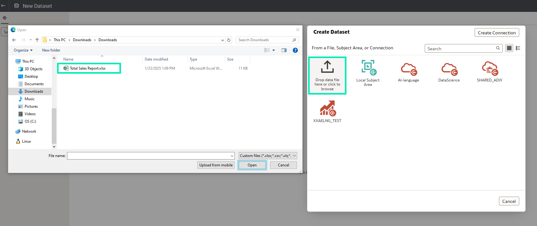
Figure 2: Choose File
After selecting the file, the preview window displays multiple sheets, each containing its respective data:
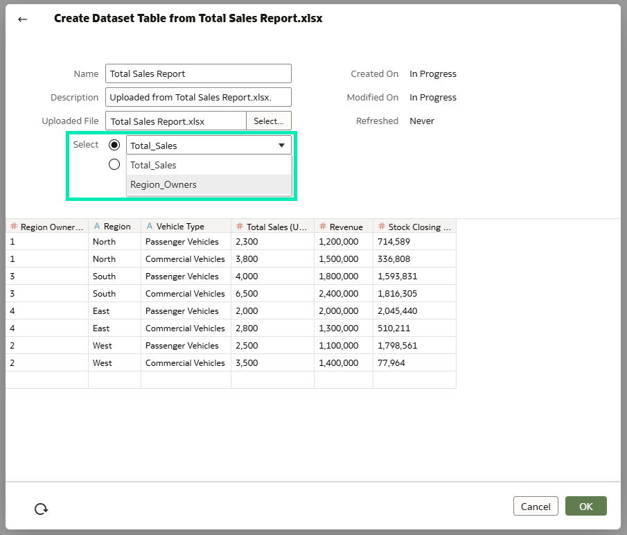
Figure 3: Dataset Preview
So now, instead of importing one sheet at a time, just choose the All Sheets option and click on OK:
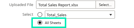
Figure 4: Choose All Sheets
As a result, the system will import all the spreadsheets in a file. Another advantage is that it automatically detects columns and creates joins between the data:
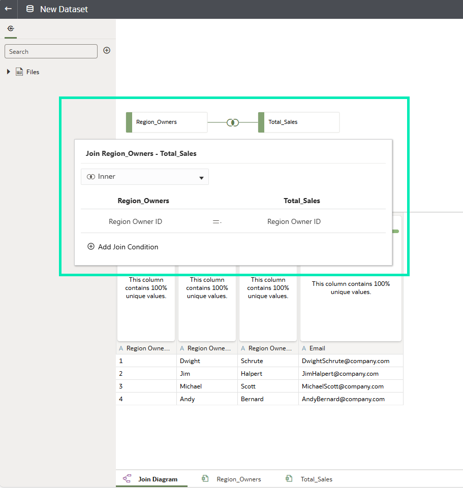
Figure 5: Auto Joins
So, in just a few clicks, multisheet data turns into a dataset ready for analysis.
Conditional Formatting for Attributes
The January 2025 OAC updates introduce another powerful enhancement: conditional formatting for attributes. Previously, only measures could be formatted, and many dashboard developers highlighted the absence of conditional formatting for attributes. We’re glad Oracle listened and extended this functionality. Let’s take a look at it!
Conditional formatting settings for attributes are accessed the same way as for measures: by right-clicking on the column you want to format, clicking on the traffic light symbol in the visualisation, or selecting the traffic light in the top-right corner of the workbook canvas:
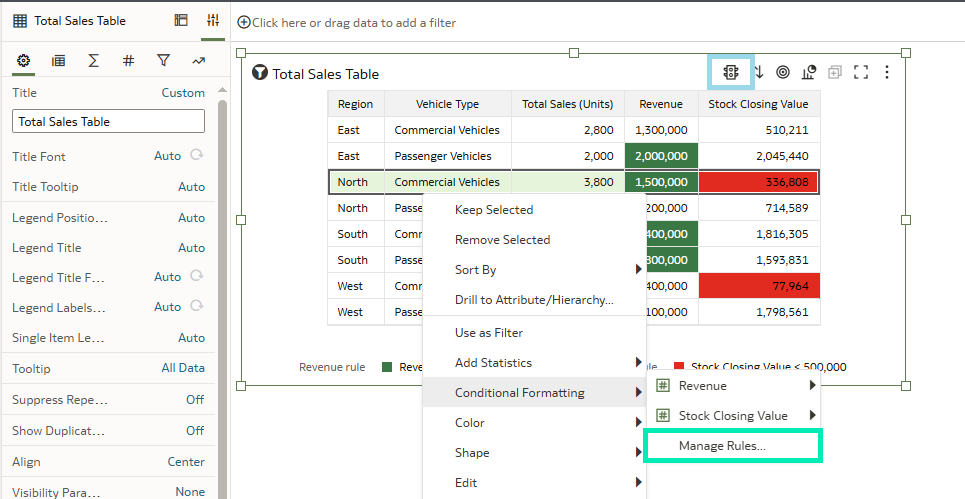
Figure 6: Select Conditional Formatting
Now, when selecting columns for formatting in the pop-up settings window, both measures and attributes are available:
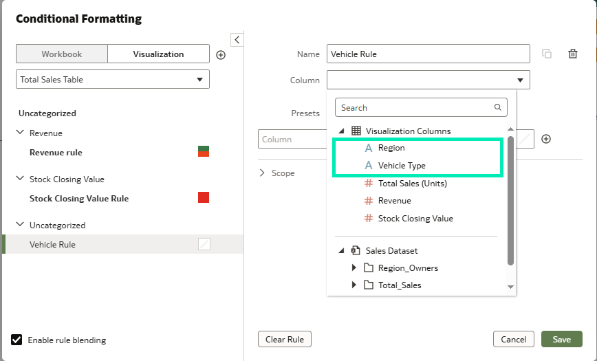
Figure 7: Select Attributes
The format of the attribute column can be customised by setting conditions for specific values. Once the conditions have been applied and saved, the changes will be reflected in the visualisation:
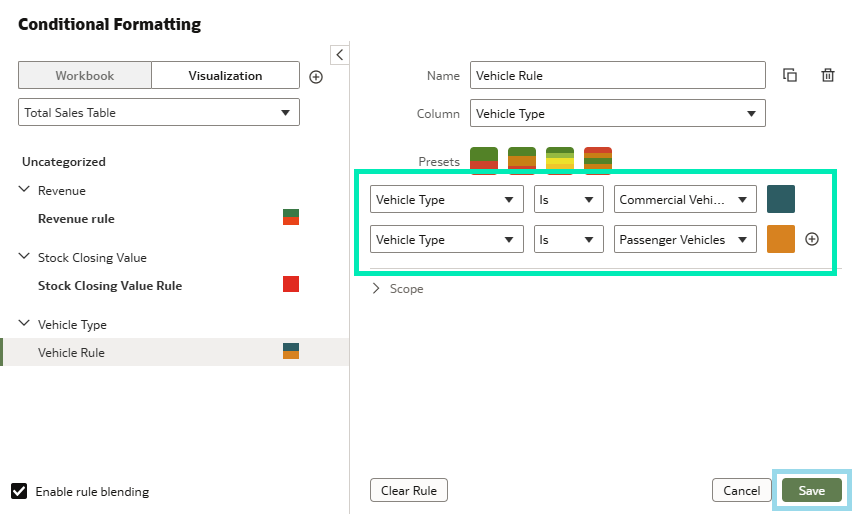
Figure 8: Set Conditions
The visual becomes more informative and helps highlight key information. Imagine an attribute appearing in multiple visualisations on a dashboard: applying conditional formatting makes the connections between them more apparent. It also enhances data clarity, making it easier to focus on the most relevant insights:
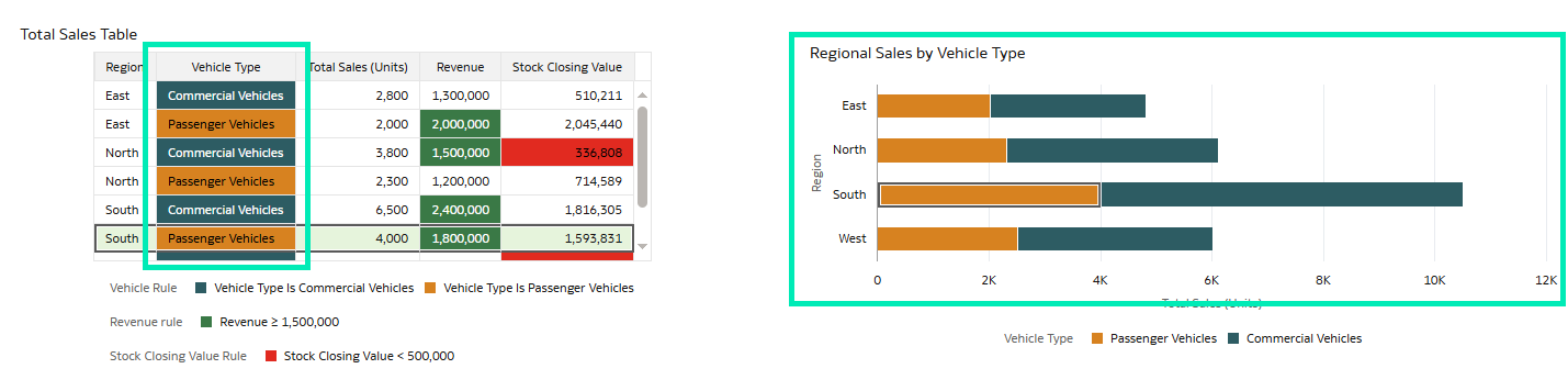
Figure 9: Result
Use Contextual Insights to Understand your Data
As AI continues to evolve and integrate more deeply into our lives, its impact on data analytics is also growing significantly, and OAC has introduced a groundbreaking update: Contextual Insights. This feature enables you to uncover deeper insights from specific data selections directly within your visualisations. The Contextual Insights feature is available for both subject areas and datasets, following the same setup process. However, for the multitable datasets, the first step is to edit the dataset and confirm that the Fact table has Preserve Grain enabled. This is not required for subject areas:
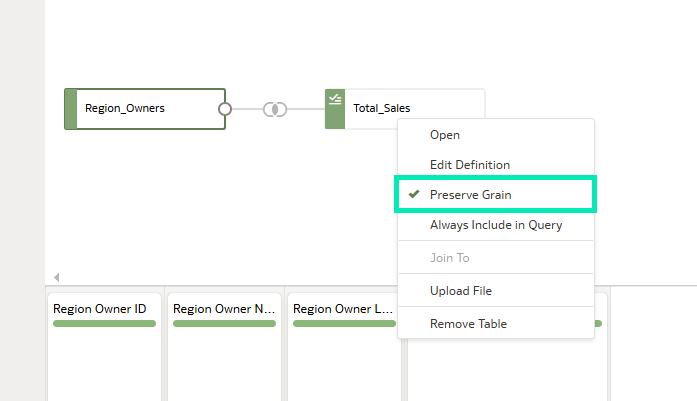
Figure 10: Preserve Grain in Fact Table
The next step is to configure the visualisation where you want to enable Contextual Insights, as this feature is applied individually to each visualisation.
In the Settings pane of the selected visualisation, navigate to the Properties tab and then to the Analytics sub-tab:
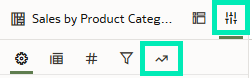
Figure 11: Select Analytics Sub-Tab
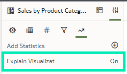
Figure 12: Turn On Explain Visualization
This next step is to select the columns that are most relevant to your isualization and drag them into the Related Columns field in the Visualization Settings pane. The AI analyses these columns to generate the most meaningful and relevant insights:
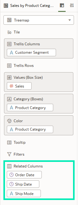
Figure 13: Add Related Columns
Then, after right-clicking on the visualisation, select Explain Selected. This will trigger the AI and after a couple of seconds you’ll see insights on how your selection compares to the rest of the data:
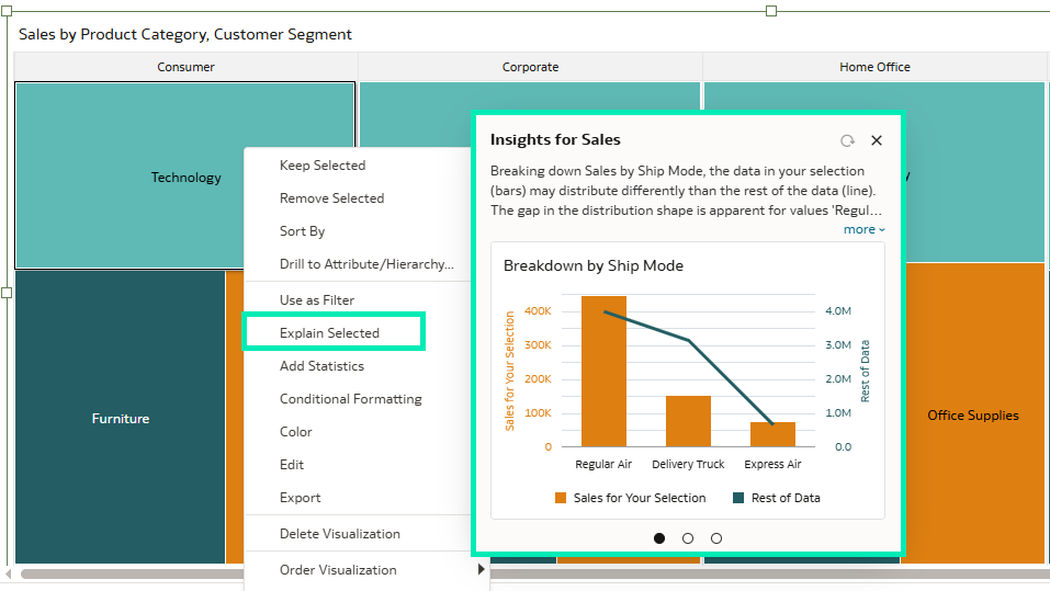
Figure 14: Result
With this new Contextual Insights feature, OAC offers deeper interaction with your data, often helping to uncover patterns that might otherwise have been missed.
Hide A Column in A Visualisation
This latest update introduced a valuable enhancement: the ability to hide columns in visualisations without modifying the underlying dataset.
With this feature, you can streamline your visualisations by concealing unnecessary columns whilst preserving the data for future analysis or reference. For instance, if a column is required solely for sorting but is not relevant for display, it can now be hidden with just a few clicks:
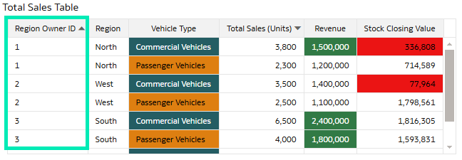
Figure 15: Table With Redundant Column Region Owner ID Used for Sorting Purposes
In the Grammar Panel for the selected table, open the Rows drop-down menu, right-click on the column, and select the Hide option:
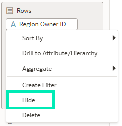
Figure 16: Hide Option in The Column Menu
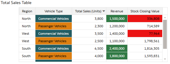
Figure 17: Result After Hiding the Redundant Column
The hidden columns remain accessible in the dataset, so you can unhide them or use them in other visualisations whenever you want. This functionality ensures a cleaner, more focused presentation of insights, enhancing readability and making dashboards more concise and easier to interpret, without compromising the flexibility or depth of your analysis.
Share A Watchlist
Another valuable addition in this update is the ability to share Watchlists directly with others, streamlining collaboration and improving accessibility to key metrics.
Watchlists provide quick access to the visualisations you use most frequently. Once created, they appear in the Featured Watchlists section on your Home page.
With this feature, users can now generate a shareable link for any Watchlist, making it easy to distribute curated sets of KPIs and metrics to team members. Whether it is a set of sales targets or operational metrics, sharing your Watchlist ensures that everyone stays aligned and informed.
Before sharing a link, access permissions must first be configured for the specific Watchlist. In this example, the Inspect option is selected for the Sales Watchlist from its action menu:
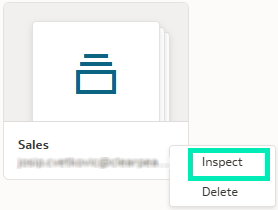
Figure 18: Inspect Option in the Watchlist Action Menu
A new window will appear, and users can be added by name or role in the Access tab, with their access permissions managed accordingly. Accesses are divided into three categories: Read-Only, Read-Write, and Full Control:
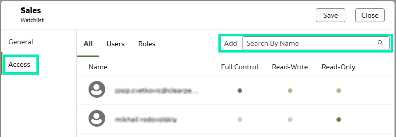
Figure 19: Access Tab with Its Features
Recipients of a shared Watchlist can access it instantly and view the metrics as intended, without needing to recreate or manually configure them. This feature is particularly useful for keeping stakeholders up-to-date with real-time data, while also ensuring consistency across teams.
Refresh Auto Insights to Include Filters
Another exciting feature in this update is the ability to refresh Auto Insights without losing active filter selections. This enhancement ensures that your insights remain relevant and tailored to your specific data view.
This feature works seamlessly by applying any active filters to the refreshed Auto Insights. For example, if you have filtered your data to focus on a specific region or time period, these filters will automatically carry over when generating refreshed insights:
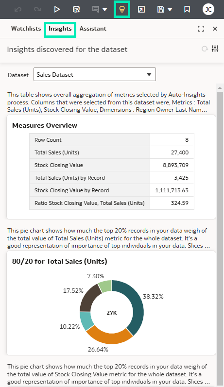
Figure 20: Auto Insights on Table Without Filters
After filtering specific regions (North, South) from the Total Sales table and refreshing Auto Insights, the insights are now relevant to the current dataset:
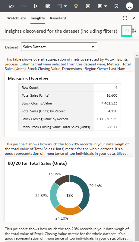
Figure 21: Auto Insights on Table Including the New Filters
With this feature, OAC allows you to quickly revisit and regenerate insights that are fully aligned with your current analysis context, without the need to reapply filters manually.
This streamlined functionality is particularly helpful for maintaining consistency in reporting and speeding up workflows, especially when working with dynamically changing datasets.
Customise Tooltips in More Visualisation Types
Oracle has expanded the ability to customise tooltips across additional visualisation types, including Maps, Sunburst, Network, and Boxplot visuals. When hovering over a data point in a visualisation, a tooltip appears displaying information related to the columns used for that specific data point. With this enhancement, you can modify the format of existing column names and values, and also add and format additional columns, parameters, and text within the tooltip.
Let’s see how this feature works with a Map visualisation:
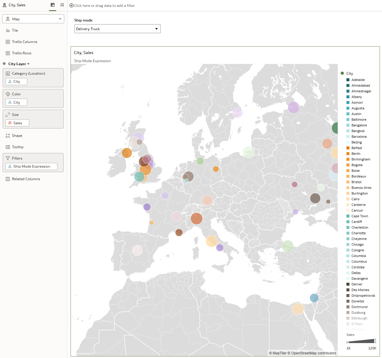
Figure 22: Chart Overlay
If we hover a data point, the default tooltip displays information based on the fields included in the visualisation:
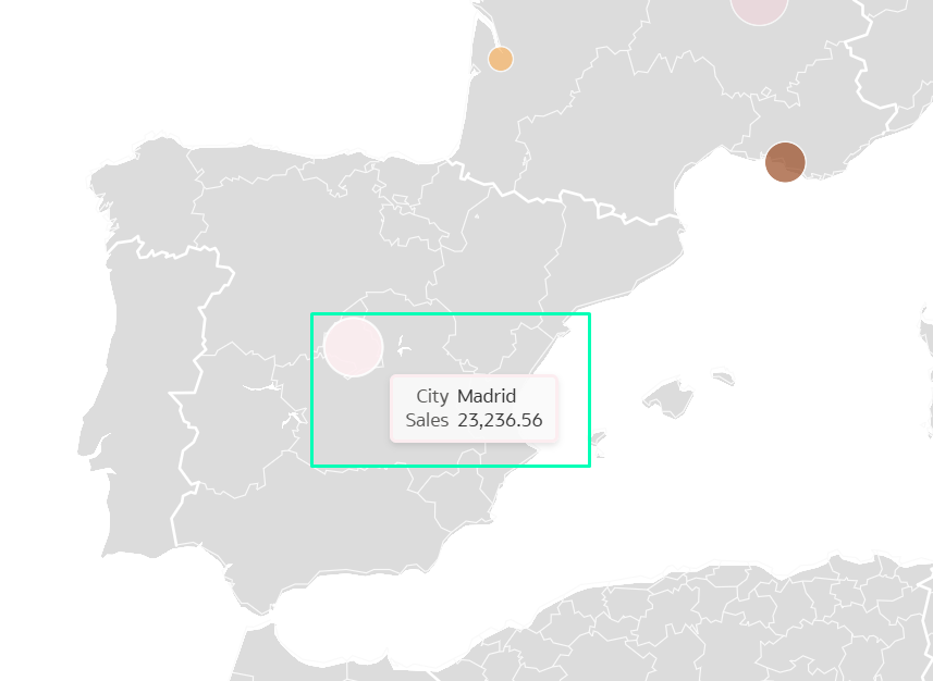
Figure 23: Default Tooltip Information
However, if we want to display additional information, such as the filtered ship mode, and format the text for better readability, we need to customise the tooltip. For example, we can modify the tooltip to show: «The total sales when the ship mode is ‘Param Ship Mode’ are ‘Sales’ in the city of ‘City’.» To do this, first select the visualisation you want to customise and click on Properties; then locate the Tooltip option, click on All Data Value, and select Custom:
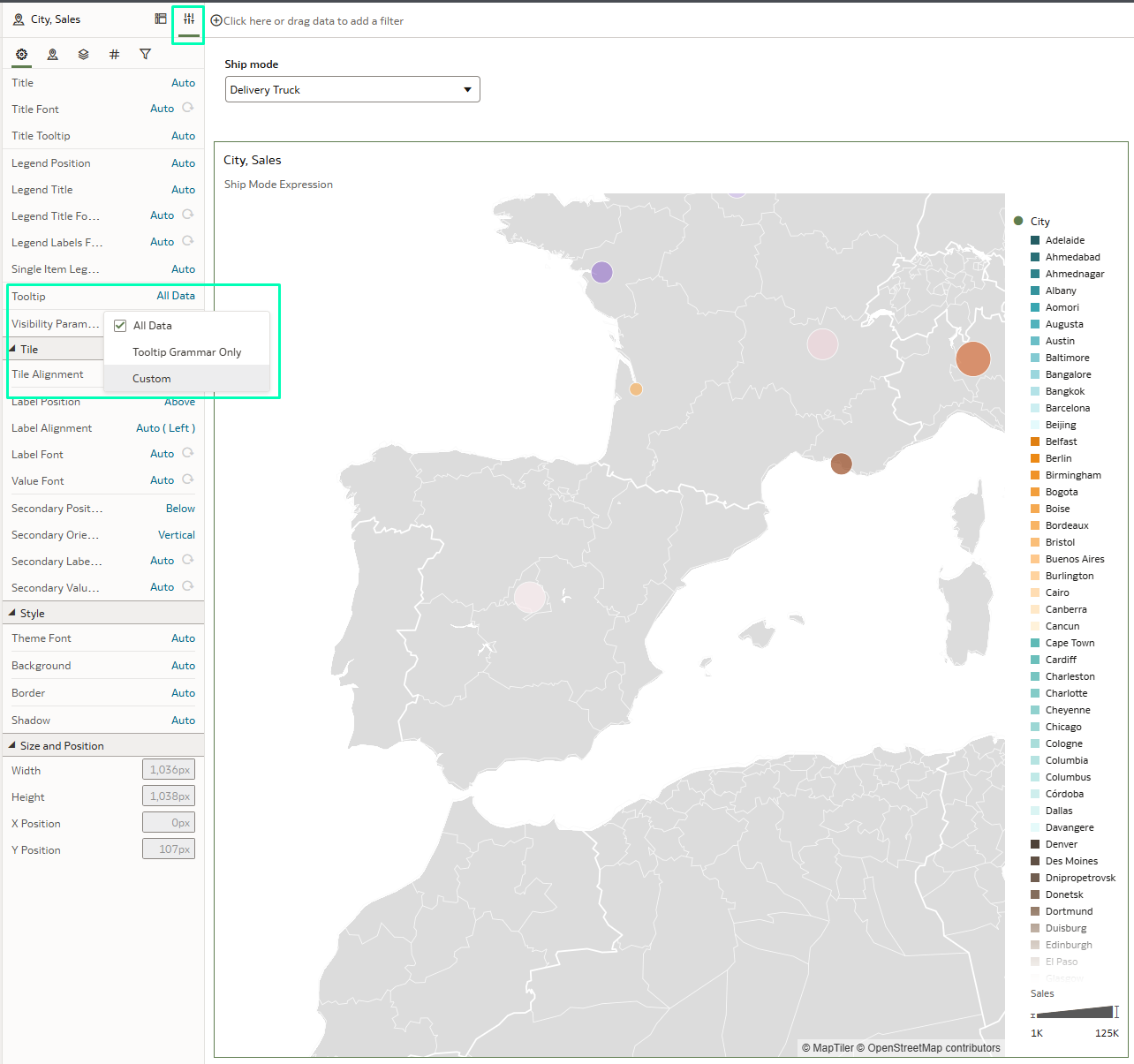
Figure 24: Properties Pane
Now you can customise it with the Custom Tooltip text editor:
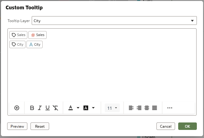
Figure 25: Custom Tooltip Text Editor
You can change the formatting of the text to bold and increase its size to 16, making the text easier to read. Additionally, you can add different colours to highlight the measures, attributes and the parameters. As shown below, the result is very similar to what can be done in any text editor, the difference being the definition of the parameters:
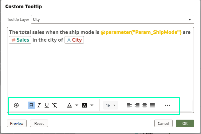
Figure 26: Custom Tooltip
This is the result:
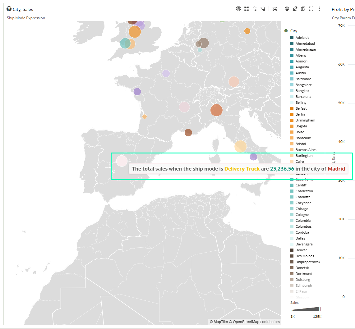
Figure 27: Result

Figure 28: Result
This is a particularly useful feature as it allows you to understand visualisations easily, create more customised deliverables, and find outliers.
Control Who Can Send and Receive Email Deliveries
One of the new security features presented in this release is the ability to control who can deliver content by email. By default, after setting up the email server, OAC does not restrict email content delivery. However, with this update, you can now grant or deny the Deliver Content in Email permission to specific users and application roles. Conversely, the Deliver Content Link in Email permission is not granted by default, so if you want to allow users to email content links, you must specifically grant this privilege.
How can we grant or deny the these permissions?
From the Classic Home page, click on the User Profile icon, and then on Administration:
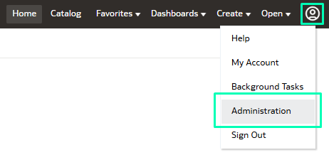
Figure 29: Administration
Click on Manage Privileges:
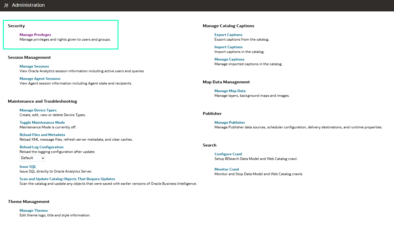
Figure 30: Manage Privileges
Go to the Delivers section where you can see both the Deliver Content in Email and Deliver Content Link in Email permissions:
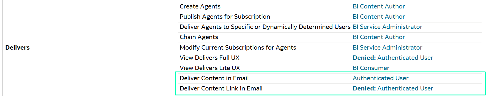
Figure 31: Delivers Section
As you can see, the Authenticated User has the Deliver Content in Email permission granted by default, allowing anyone to send or receive content by email.
In contrast, the Deliver Content Link in Email permission is denied for the Authenticated User, meaning no one can send or receive content links by email.
To change any of the default values, click on the Authenticated User role and grant or deny the permissions for specific users or application roles:
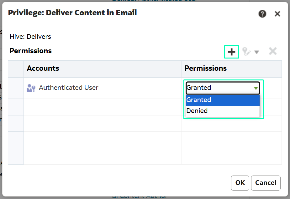
Figure 32: Privilege: Deliver Content in Email Permissions
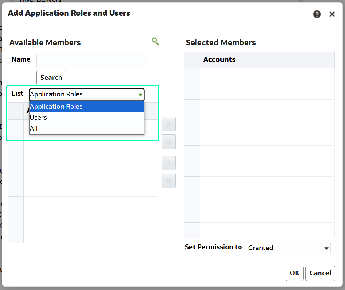
Figure 33: Privilege: Add Application Roles and Users
The main limitation of this feature is that these privileges only apply to content created from the Classic Home page, like analyses, dashboards, reports, etc. Nevertheless, it remains a simple and practical way to implement an extra layer of security in email content delivery.
Conclusions
Oracle continues enhancing the analytics experience, making it more personalised, efficient, and secure. Now you can customise tooltips across multiple visualisations and apply conditional formatting to attributes, adding greater flexibility and precision to your analyses. With the Watchlists sharing feature, OAC has improved collaboration between users; and thanks to AI technologies, the Contextual Insights feature helps to uncover a deeper understanding of data, making your analyses more interactive and self-explanatory.
These updates, along with many other enhancements, make OAC an even more powerful and user-focused tool for analysis and data visualisation. Judging by what we’ve seen in January, Oracle will keep evolving and bring us fresh new features throughout the year. Stay tuned to our blog!
Here at ClearPeaks, we specialise in delivering cutting-edge OAC solutions to help businesses unlock the full potential of their data. Whether you need to optimise visualisations, enhance collaboration with Watchlists, refine security controls, or streamline your insights, our expert team is here to support you. Reach out to us today!